Interpretation of PCA#
One of the most significant benefits of PCA over other dimensionality reduction approaches is that the results of PCA can be interpreted. Here, we will look at interpreting the principal components from some data, specifically the breast cancer data highlighted previously. We can read the data, scale it and perform the PCA analysis.
import pandas as pd
from sklearn.preprocessing import StandardScaler
from sklearn.decomposition import PCA

data = pd.read_csv('./../data/breast-cancer.csv')
scaled_data = StandardScaler().fit_transform(data[data.columns[1:]])
pca = PCA()
transformed = pca.fit_transform(scaled_data)
pc = pd.DataFrame(transformed, columns=['PC{}'.format(i + 1) for i in range(transformed.shape[1])])
pc['Diagnosis'] = data['Diagnosis']
pc.head()
| PC1 | PC2 | PC3 | PC4 | PC5 | PC6 | PC7 | PC8 | PC9 | PC10 | Diagnosis | |
|---|---|---|---|---|---|---|---|---|---|---|---|
| 0 | 5.224155 | 3.204428 | -2.171340 | -0.169276 | -1.514252 | 0.113123 | 0.344684 | 0.231932 | -0.021982 | -0.011258 | Malignant |
| 1 | 1.728094 | -2.540839 | -1.019679 | 0.547539 | -0.312330 | -0.935634 | -0.420922 | 0.008343 | -0.056171 | -0.022992 | Malignant |
| 2 | 3.969757 | -0.550075 | -0.323569 | 0.397964 | 0.322877 | 0.271493 | -0.076506 | 0.355050 | 0.020116 | -0.022675 | Malignant |
| 3 | 3.596713 | 6.905070 | 0.792832 | -0.604828 | -0.243176 | -0.616970 | 0.068051 | 0.100163 | -0.043481 | -0.053456 | Malignant |
| 4 | 3.151092 | -1.358072 | -1.862234 | -0.185251 | -0.311342 | 0.090778 | -0.308087 | -0.099057 | -0.026574 | 0.034113 | Malignant |
How Many Principal Components to Investigate?#
A common question with many dimensionality reduction algorithms centres on how many dimensions we want. The answer to this question is usually very problem-specific and depends on what information you want to gain about your data. However, for PCA, the scree plot is a useful tool for visualising the information present in each component.
The scree or elbow plot involves plotting the explained variance (or explained variance ratio) as a function of components. So, for the breast cancer dataset:
import matplotlib.pyplot as plt

fig, ax = plt.subplots()
ax.plot(range(1, len(pca.explained_variance_ratio_) + 1), pca.explained_variance_ratio_, '.-')
ax.set_xlabel('Principal Component')
ax.set_ylabel('Proportion of Variance Explained')
plt.show()
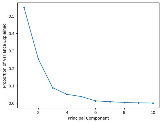
The scree or elbow plot aims to identify the “elbow” in the dataset. This is a subjective approach, but the elbow is essentially the point at which adding more components doesn’t significantly increase explained variance. So, for the plot above, the elbow is around three principal components, so the first two should be sufficient for most interpretations.
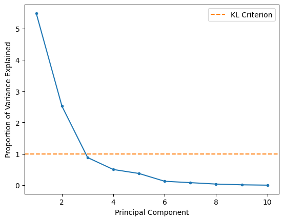
A slightly older approach uses principal components with eigenvalues greater than one; recall that the eigenvalue of the covariance matrix is the explained variance. We can plot this so-called Kaiser criterion (or KL1) on our scree plot to see if this agrees with our suggestion from the elbow method.
fig, ax = plt.subplots()
ax.plot(range(1, len(pca.explained_variance_) + 1), pca.explained_variance_, '.-')
ax.axhline(1, color='#ff7f0e', linestyle='--', label='KL Criterion')
ax.set_xlabel('Principal Component')
ax.set_ylabel('Proportion of Variance Explained')
ax.legend()
plt.show()
What Do the Principal Components Mean?#
It is possible to use the principal components and their eigenvalues to derive an interpretation of the data. This can be extremely powerful in understanding the terms and relationships that lead to our observations. The first interpretative tool is the loading matrix, which gives a quantitative description of how each feature contributes to a given principal component. The loading of the nth principal component is the n-th row of the component matrix (where the principal components are the columns) multiplied by the nth eigenvalue. The code below calculates the loading matrix for the first two principal components and plots them against the relevant features.
import numpy as np

loading_matrix = pd.DataFrame(pca.components_[:2].T * np.sqrt(pca.explained_variance_[:2]),
                              columns=['PC1', 'PC2'], index=data.columns[1:11])

fig, ax = plt.subplots(figsize=(6, 4))
loading_matrix.plot(kind='bar', ax=ax)
ax.set_xlabel('Features')
ax.set_ylabel('Loading')
plt.show()
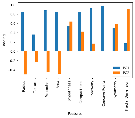
We can see from the above plot that the first principal component contains significant positive loading from most of the features. This means that a positive value for the transformed data into the first principal component is associated with a positive value for all features. On the other hand, the second principal component has a negative loading for many features (radius, texture, etc.). This means that a positive value for the transformed data into the second principal component is associated with a negative value for these features.
Let’s look at the data transformed by the first and second principal components. We have coloured this data to determine whether the cancer was found to be malignant or benign.
import seaborn as sns

sns.jointplot(x='PC1', y='PC2', hue='Diagnosis', data=pc, kind='scatter')
plt.show()
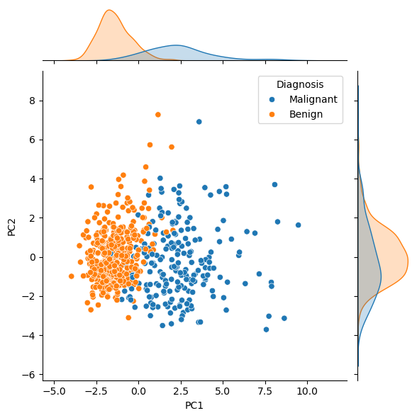
From this, it is clear that benign tumours typically had less principal component 1. Looking at this in the context of the loading matrix plot above, we can rationalise that malignant tumours typically have larger values of the features, such as concave points, than benign ones. One could imagine using a clustering algorithm on principal component 1 to classify new data as benign or malignant. Principal component 2 is more challenging to interpret, as the distinction is less clear. This is expected, given that principal component 2 explains only 25 % of the variance, compared against principal component 1’s 60 %.