Principal Component Analysis#
The first of the dimensionality reduction algorithms that we will look at is principal component analysis (PCA). PCA benefits from being computationally efficient compared to other dimensionality reduction approaches. Additionally, it is possible to interpret the results by tending towards ideas of explainable machine learning that we will meet again later. However, PCA assumes that there are linear trends in the data that can be used to bring different features together. This means that it may be less effective where the trends are non-linear.
What Is the Aim of PCA?#
The aim of PCA is to transform the data into a new coordinate system defined by the data’s principal components. These new axes (the principal components) are ordered by how much of the variance is present in the original data they explain. A matrix with these principal components as columns, scaled by the amount of variance each describes, produces a vector space where all variables are distributed with a standard deviation of 1 and a zero covariance. Let’s see that in action for a two-dimensional example.
import pandas as pd

data = pd.read_csv('./../data/pca-example.csv')
data
| x | y | |
|---|---|---|
| 0 | -1.096145 | -1.047366 |
| 1 | -0.774176 | -0.784034 |
| 2 | 0.968481 | 1.809710 |
| 3 | 0.663523 | 1.037193 |
| 4 | 0.201175 | -0.137998 |
| ... | ... | ... |
| 195 | 0.477986 | -0.345609 |
| 196 | -1.033106 | -0.614364 |
| 197 | -0.228703 | 0.174325 |
| 198 | 0.409484 | 1.032811 |
| 199 | 0.429081 | 1.029990 |
200 rows × 2 columns
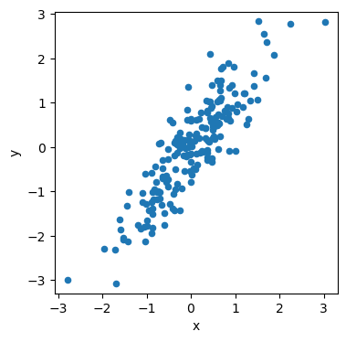
This data has two columns, x and y, and 200 datapoints. We can visualise this.
import matplotlib.pyplot as plt

fig, ax = plt.subplots(figsize=(4, 4))
data.plot(kind='scatter', x='x', y='y', ax=ax)
ax.axis('equal')
plt.show()
If we pass this data, as is, to a PCA algorithm (we will use the scikit-learn), we should get a pair of principal component vectors.
from sklearn.decomposition import PCA

pca = PCA()
pca.fit(data)
pca.components_
array([[ 0.58603801,  0.81028356],
       [ 0.81028356, -0.58603801]])
Each of the columns in this vector is a principal axis. We then scale by their explained variance (or rather the squared root of the explained variance).
pca.explained_variance_
array([1.7923072 , 0.10457704])
import numpy as np

weighted_components = pca.components_ / np.sqrt(pca.explained_variance_[:, np.newaxis])
weighted_components
array([[ 0.43774335,  0.60524443],
       [ 2.50564105, -1.8122062 ]])
The matrix above can then be used to perform a linear transformation on the original data.
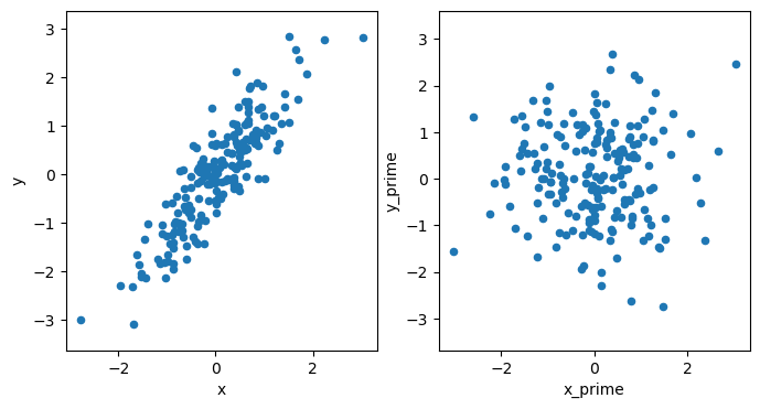
We will add the results of the linear transformation into the original data object as x_prime and y_prime.
transformed = weighted_components @ data.T
data['x_prime'] = transformed.loc[0]
data['y_prime'] = transformed.loc[1]
We can see that the result of the transformation has a covariance matrix, approximating an identify matrix.
data[['x_prime', 'y_prime']].cov()
| x_prime | y_prime | |
|---|---|---|
| x_prime | 1.000000e+00 | -7.242745e-16 |
| y_prime | -7.242745e-16 | 1.000000e+00 |
Then, when we plot this, the data are distributed as expected.
fig, ax = plt.subplots(1, 2, figsize=(8, 4))

data.plot(kind='scatter', x='x', y='y', ax=ax[0])
data.plot(kind='scatter', x='x_prime', y='y_prime', ax=ax[1])
ax[0].axis('equal')
ax[0].set_aspect('equal')
ax[1].axis('equal')
ax[1].set_aspect('equal')
plt.show()
What Are the Principal Components?#
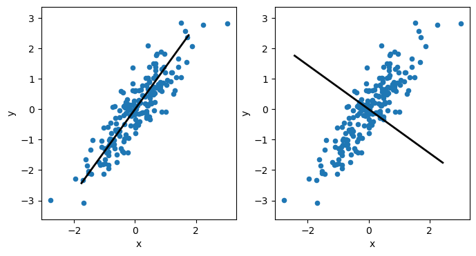
The principal components are vectors that describe the (new) dimension of the highest variance in the data. Each principal component must be orthogonal (i.e., at a right angle) to each other. So, suppose we visualise the above data’s first and second principal components. In that case, we see that the first component will follow the direction of the data along the positive diagonal in the plot. Meanwhile, the second principal component must be orthogonal to this so that it will sit at a right angle to the first.
fig, axes = plt.subplots(1, 2, figsize=(8, 4))
for i, ax in enumerate(axes):
    data.plot(kind='scatter', x='x', y='y', ax=ax)
    ax.plot([-pca.components_[i, 0] * 3, pca.components_[i, 0] * 3],
            [-pca.components_[i, 1] * 3, pca.components_[i, 1] * 3], color='k', lw=2)
    ax.axis('equal')
    ax.set_aspect('equal')
plt.show()
Where Does PCA Go Wrong?#
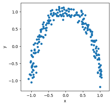
PCA assumes there are linear relationships present in the data. Consider the following moon-shaped data.
data = pd.read_csv('./../data/moon.csv')
fig, ax = plt.subplots(figsize=(4, 4))
data.plot(kind='scatter', x='x', y='y', ax=ax)
ax.axis('equal')
plt.show()
There are some relationships in the data that we should aim to describe. However, is we attempt to use the data’s principal components to describe it, we find that both are equally weighted.
pca = PCA()
pca.fit(data)
pca.explained_variance_
array([0.4965731, 0.4002065])
This isn’t surprising if we visualise the principal components plotted on top of the data.
fig, axes = plt.subplots(1, 2, figsize=(8, 4))
for i, ax in enumerate(axes):
    data.plot(kind='scatter', x='x', y='y', ax=ax)
    ax.plot([-pca.components_[i, 0] * 3, pca.components_[i, 0] * 3],
            [-pca.components_[i, 1] * 3, pca.components_[i, 1] * 3], color='k', lw=2)
    ax.axis('equal')
    ax.set_aspect('equal')
plt.show()
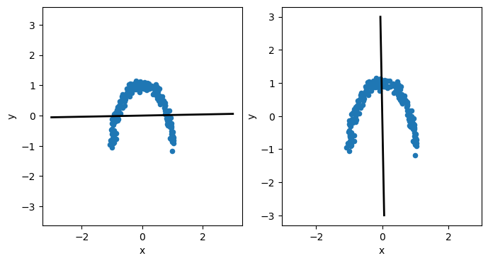
The components cannot describe the curve in the data; instead, they sit along \(x=0\) and \(y=0\). This is because the principal components can only be linear, and the non-linear relationships present in the data cannot be accurately modelled. Therefore, it is generally a good idea to check the linearity of your data before PCA is applied.
Warning
There is no hard rule for how linear data must be to use PCA successfully. However, it is essential to consider the model (for PCA, it is a linear one) that is being assumed.